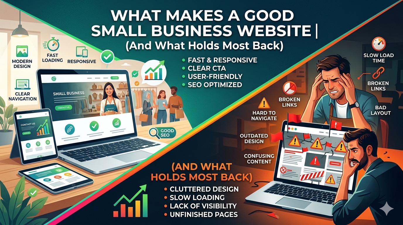
Most small business owners know their website is not performing the way it should. Fewer can articulate exactly why, or what a genuinely effective site actually looks like.
What makes a good small business website is not subjective. There are measurable characteristics that consistently separate high performing sites from average ones: clarity, speed, mobile usability, conversion architecture, and trust signals. The businesses that get these right generate leads from their website around the clock. The businesses that get them wrong are effectively invisible online.
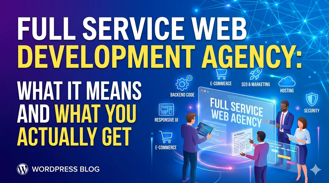
This guide covers the eight qualities shared by effective small business websites, and the common mistakes that hold most sites back.
1. A Clear Value Proposition in the First Five Seconds
A visitor lands on your homepage and asks, consciously or not: is this relevant to me? Most small business websites answer that question too slowly, too vaguely, or not at all.
The most important real estate on your website is the hero section, the area visible before any scrolling. In those first five seconds, a visitor should be able to answer:
- What does this business do?
- Who is it for?
- Why should I choose them over the alternatives?
“Welcome to [Business Name]” is not a value proposition. “Custom WordPress Websites for Service Businesses in the Southeast, Designed to Generate Leads” is.
The test: hand your homepage to someone unfamiliar with your business. Ask them to explain what you do after five seconds. If they cannot, your value proposition needs work.
2. Fast Load Times on Every Device
Page speed is both a user experience issue and an SEO issue. Research consistently shows that 53% of mobile visitors leave a page that takes more than three seconds to load. For every additional second of load time, conversions drop measurably.
From an SEO perspective, Google’s Core Web Vitals, the set of metrics that measure load speed, visual stability, and interactivity, are a direct ranking factor. A slow site ranks lower in search results, which means fewer visitors before they even reach your site.
Good load time targets for small business websites:
Largest Contentful Paint (LCP): under 2.5 seconds
Cumulative Layout Shift (CLS): under 0.1
Interaction to Next Paint (INP): under 200 milliseconds
You can check your scores for free at Google PageSpeed Insights. If your scores are in the “Needs Improvement” or “Poor” range, this is your highest priority fix, before any visual redesign work.
See our full breakdown of what these metrics mean in our Core Web Vitals guide for small business.
3. Genuine Mobile First Design
Mobile first means the site was designed for small screens first and expanded to desktop, not designed for desktop and squeezed into mobile. The difference is visible and measurable.
A truly mobile first site:
Has text large enough to read without zooming (minimum 16px)
Has buttons and tap targets large enough to hit with a thumb (minimum 44px)
Loads quickly on a 4G connection
Does not require horizontal scrolling
Has forms short enough to complete on a small keyboard without frustration
Navigates cleanly with a thumb accessible mobile menu
With more than 60% of web traffic now coming from mobile devices, a site that only works well on desktop is a site that only works for a minority of your visitors.
4. Intuitive Navigation
Navigation should be invisible in the best possible sense: visitors should always know where they are and where to go next without thinking about it.
Common navigation mistakes on small business websites:
- Too many items (more than seven creates cognitive overload)
- Jargon based labels that visitors do not recognize (“Solutions” instead of “Services,” “Resources” instead of “Blog”)
- Inconsistent navigation between pages
- No clear indication of which page you are currently on
- Mobile navigation that does not work properly
The navigation structure should reflect how your customers think about your business, not how you organize it internally. If your customers come to you looking for “kitchen remodeling,” the navigation item should say “Kitchen Remodeling,” not “Residential Services.”
5. Credibility and Trust Signals
A small business asking a visitor to call, book, or buy is asking them to trust an entity they have never dealt with before. Good websites reduce the friction of that trust gap.
Trust signals that work:
- Real customer reviews and testimonials with names and, ideally, photos. Generic testimonials (“Great service! Highly recommend!”) are ignored. Specific, detailed reviews (“They redesigned our kitchen in three weeks and the result exceeded what we had imagined, on budget”) are credible.
- Recognizable credentials and certifications specific to your industry
- Named team members and real photos, stock photos of “business people” undermine trust
- A physical address even for service businesses, invisible businesses are harder to trust
- Response time indicators (“We respond within one business day”) set expectations and reduce anxiety
- A visible phone number in the header, some customers will only call
One trust signal with outsized impact: a third party rating. A verified 4.8/5 from Google Reviews or a similar platform consistently outperforms any claim you make about your own quality.
6. Clear, Specific Calls to Action
Every page should have one primary action you want the visitor to take. Not three, not five, one. When every page tries to do everything, visitors do nothing.
What makes a call to action work:
- Specificity: “Book a Free 30 Minute Consultation” outperforms “Contact Us” because it tells visitors exactly what will happen next
- Visibility: The primary CTA should be visible without scrolling on every page
- Repetition: Appear once near the top and again at the bottom of long pages
- Low commitment language: “Get a Free Quote” is lower friction than “Sign a Contract”, match the ask to where the visitor is in their decision process
- Action verbs: Start with what the visitor will do (“Book,” “Get,” “Start,” “Schedule”) not what you want them to do
7. Content That Answers Real Questions
The best small business websites are useful. They help visitors make decisions, about whether this business is right for them, about what a project involves, about what things cost, about how to solve the problem that brought them to the site in the first place.
Useful content that small business websites should have:
- Service pages that explain what you actually do, not just that you do it
- A clear explanation of your process (what happens after someone contacts you?)
- Transparent pricing information, or at least honest context about how pricing works
- A blog or resource section that answers the questions your customers ask most often
- FAQ sections on service pages that pre answer objections
Content is also your primary SEO lever. Pages that comprehensively answer questions people are actively searching for rank in Google, and generate inbound traffic without paid advertising. See our guide on website design for small business for how content strategy connects to the overall design.
8. Accessibility and Inclusivity
An accessible website is not just a legal consideration, it is a business one. Approximately 26% of US adults live with some form of disability, according to the CDC. Websites that do not meet basic accessibility standards exclude a significant portion of potential customers.
Basic accessibility requirements for small business websites:
- Images have descriptive alt text
- Text has sufficient contrast against background colors (4.5:1 minimum for normal text)
- All functionality is navigable by keyboard, not just mouse
- Videos have captions
- Forms have properly labeled input fields
Accessibility also overlaps with SEO. Many accessibility practices, descriptive alt text, semantic HTML, clear heading structure, are the same things that help search engines understand your content.
What Holds Most Small Business Websites Back
Understanding what makes a good site is half the battle. The other half is recognizing what holds most small business sites back from performing at their potential.
Prioritizing Looks Over Function
A visually impressive website that loads slowly, confuses visitors, or has unclear CTAs underperforms a simpler, faster site every time. Design decisions should always be evaluated against their impact on user experience and conversion, not just aesthetics.
Ignoring the Mobile Experience
Building or approving a website based on how it looks on a desktop monitor is one of the most common and costly mistakes in small business website projects. If you are reviewing designs or making approvals, always check on your phone first.
Outdated or Thin Content
A site with outdated information, old pricing, staff who no longer work there, services you no longer offer, erodes trust faster than a poorly designed site. Thin content pages (service pages with two paragraphs) rank poorly in search and convert poorly with visitors.
No Measurement in Place
A website without Google Analytics and Google Search Console connected is a website flying blind. You cannot improve what you do not measure. These tools are free, and setup takes less than an hour.
If you recognize these problems in your current site, our guide on signs your website is costing you customers breaks down the full picture of what underperformance looks like, and what to do about it.
Building a Good Small Business Website
Good website design for small business is achievable at a range of budgets. The businesses that get it right are not necessarily the ones with the largest design budgets, they are the ones who understood what their website needed to accomplish and made design decisions in service of that goal.
Start with clarity about your goals. Then evaluate your current site honestly against the eight qualities above. The gaps you find are your roadmap.
If you want expert help identifying what your site needs and building it right, contact DevVerx. Our UI/UX design services are built around one goal: websites that work harder for your business. Our 4.8/5 client rating reflects a decade of doing exactly that.