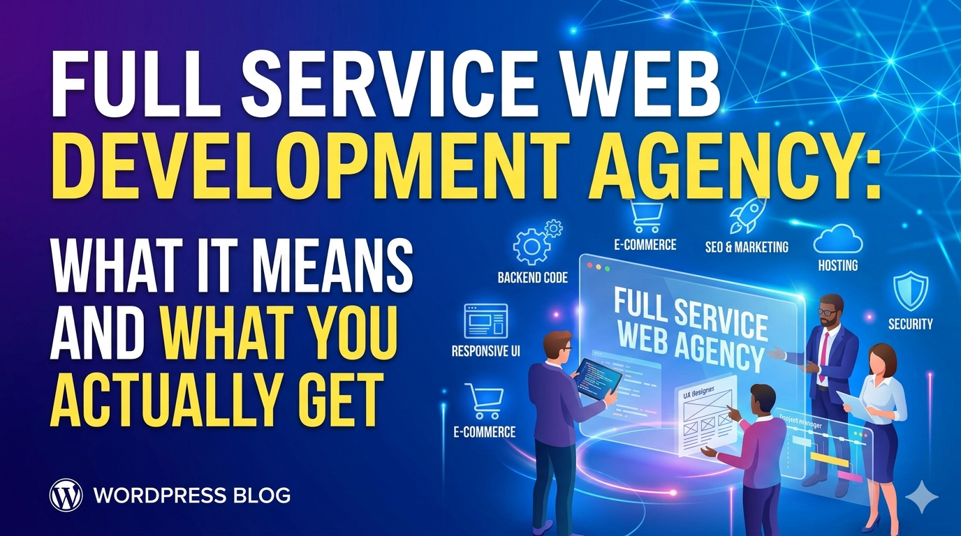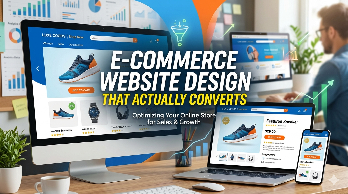
There’s a wide gap between an e-commerce site that looks good and one that sells. Most business owners focus on the visual logo, colors, fonts, lifestyle imagery. These things matter, but they’re not what drives conversion.
The design decisions that actually move revenue are structural: how the checkout flow is sequenced, where trust signals appear relative to the buy button, how the product page handles variants, how the cart behaves on mobile. Most of these are invisible to someone looking at a static screenshot which is why so many “beautifully designed” stores underperform.
This guide covers the design elements that actually drive conversion, what to look for in an e-commerce design agency, and how to tell the difference between a site that will look good in a portfolio and one that will generate revenue.
The 7 Design Elements That Drive E-Commerce Conversion
1. Product Page Hierarchy
The product page is where the conversion decision happens. The design hierarchy should guide the visitor to one action: add to cart.
What converts:
Primary product image dominant and high resolution buyers need to see what they’re buying, at sufficient quality to evaluate it
Product name and price immediately visible without scrolling on both desktop and mobile
Variant selectors (size, color) placed directly above or below the add to cart button not buried in a tab
Add to cart button high contrast, full width on mobile the single most tapped element on the page; it should be impossible to miss
Reviews visible above the fold on desktop social proof at the decision point, not at the bottom after a long scroll
What doesn’t convert:
Beautiful product photography with the add to cart button pushed below the fold
Variant selectors in a modal or dropdown that requires multiple interactions
Reviews buried below specifications tables, shipping info, and blog post links
2. Mobile Checkout Design
Mobile is where cart abandonment happens. The checkout form on a phone is where most of the revenue is lost.
High conversion mobile checkout characteristics:
Single column form layout two column inputs require too much lateral movement on small screens
Appropriate keyboard types for each field numeric keyboard for phone numbers and card numbers, email keyboard for email fields (this is a detail that signals craft)
Large, well spaced input fields the default tap target recommendation is 44×44px; smaller than that introduces errors
Minimal steps three steps maximum from cart to order confirmation; every additional step is an abandonment opportunity
Progress indicator “Step 2 of 3” reduces anxiety and prevents premature exits
3. Trust Signals Placement Matters More Than Presence
Most e-commerce stores have trust signals. Few place them where they matter.
Trust signals work at the moment of doubt and doubt peaks at two moments: when a visitor first evaluates whether to engage, and when they’re about to enter payment information.
On the product page: Customer review aggregate (star rating + count) near the product name, not below product specs. Return policy summary near the add to cart button “30 day returns” at the point of commitment reduces hesitation.
At checkout: Security badge, accepted payment icons, and return policy summary visible near the payment fields. Not just in the footer next to where the card number is typed.
A trust signal in the footer helps no one at the moment of payment entry.
4. Cart Experience
The cart is a confirmation step and a conversion opportunity. It should:
Show complete order details: product name, variant, quantity, price, subtotal everything the customer needs to confirm before proceeding
Display shipping estimate: “Free shipping” or the calculated cost, before checkout surprises at checkout drive abandonment
Include a clear, prominent checkout button: styled to be the most visually dominant action on the page
Support quantity editing and item removal without leaving the cart page forcing the user to navigate back to a product page to change quantity breaks the flow
Offer related items only if they’re genuinely relevant generic upsells are noise
5. Category and Collection Page Design
Category pages drive the browsing experience and capture search traffic. Their design affects both SEO and conversion.
Filtering and sorting: Product filtering by relevant attributes (size, color, price, material) is a conversion driver customers who can narrow results find what they’re looking for faster. Sorting by price, newest, and popularity covers most browse intents.
Product card design: The thumbnail, product name, price, and a clear “Add to Cart” or “View” action. On mobile, cards should be large enough to tap accurately. Hover states (showing multiple product images on hover) improve desktop conversion.
Category page content: A brief introduction paragraph above the product grid helps Google understand the page and can rank the category page for product type searches. “Men’s running shoes our full collection of lightweight trainers for road and trail” is a small addition that earns disproportionate SEO value.
6. Speed as a Design Element
Design choices directly affect load speed, which directly affects conversion. These specific design decisions compound into slow stores:
- Uncompressed images: Product photography at 4000×4000px served at full resolution is the most common cause of slow page loads. Images should be compressed and sized for display dimensions.
- Too many custom fonts: Each font weight is a separate HTTP request. Limit to two typefaces, three weights total.
- Heavy animations and parallax effects: These look impressive in design mockups and perform poorly on mid range mobile devices. Use sparingly and always test on a real phone.
- Third party scripts loaded synchronously: Live chat, pop up tools, analytics, and ad pixels all add to load time. Load them asynchronously and prioritize only what’s necessary.
A site that scores 90+ on Google PageSpeed mobile converts better than one that scores 50. This is not a design opinion it’s measured consistently in e-commerce conversion data. Google’s Core Web Vitals research documents the specific performance thresholds that affect both rankings and user experience.
7. Empty States and Error Handling
These are the design elements no one talks about until they encounter them:
- Search with no results: “No results for ‘widget'” should offer alternatives browse categories, popular products, contact support. An empty white page with a “no results” message is a dead end.
- Out of stock products: Design for back in stock notifications email capture at the product level is a conversion recovery mechanism. “Sold out” with no option to follow up loses the customer.
- Declined payment: Clear, non alarming error messages that tell the customer what to do next. “Your card was declined” alone is not actionable. “Your card was declined please check the card number and try again, or use a different card” is.
What to Look for in an E-Commerce Design Agency
They show you the mobile experience without being asked: Any agency presenting portfolio work for an e-commerce project should proactively show you the mobile product page and checkout. If you have to ask, they know it’s a weakness.
They can explain the conversion rationale behind design decisions: “We designed it this way because…” with a conversion reason, not an aesthetic one. “We put reviews here because buyers check them before buying, not after” is a different level of understanding than “we thought it looked clean.”
Their portfolio sites are fast: Open two or three of their live e-commerce portfolio sites on your phone and feel the speed. Then run them through PageSpeed Insights. Performance is an expression of design quality.
They’ve worked with your product type: An agency that primarily designs fashion stores may not have strong instincts for a B2B industrial catalog with hundreds of technical product variants. Relevant experience accelerates both the design process and the quality of the outcome.
They include responsive design testing as part of delivery: Not “the site is mobile responsive” actual device testing. Real phones, not just browser resize.
What DevVerx Delivers in E-Commerce Design
Our e-commerce design process is built around conversion, not aesthetics. With a 4.8/5 client rating and projects including Dubai Fun Tour’s booking platform, we start with the checkout flow and product page the highest stakes pages and design everything else in service of those.
Custom themes from code, not templates which means no design ceiling and no inherited performance debt from a shared template. Every component is built for your catalog, your product types, and your customers.
Performance is a delivery standard: Core Web Vitals passing, mobile PageSpeed 80+, and images compressed and served via CDN on every launch.
Book a strategy call to discuss your e-commerce design project, or explore our e-commerce services.
For context on the full e-commerce development process beyond design, see our complete e-commerce development guide. For guidance on choosing an agency, see our e-commerce development agency guide.
Frequently Asked Questions
What makes an e-commerce website design convert?
Conversion driven design prioritizes the product page hierarchy, mobile checkout flow, and trust signal placement not aesthetics. The highest impact changes are usually structural: where the add to cart button is relative to product images and variants, how checkout is sequenced on mobile, and where security signals appear near the payment step.
How much does e-commerce website design cost?
Design is typically included in the overall development cost. Template based designs (using a premium theme) are included in builds starting at $2,000–$6,000. Custom e-commerce design (built from scratch) is included in professional WooCommerce builds ($8,000–$20,000) and custom application development ($20,000+). See our cost guide for full pricing context.
What’s the most important page to design well in an e-commerce site?
The product page and the mobile checkout, in that order. The product page is where the purchase decision happens; the checkout is where it’s completed. Both need explicit design attention not just default platform behavior.
How do I know if my e-commerce design is hurting conversion?
Check: Google PageSpeed mobile score (below 60 is a problem), mobile checkout abandonment rate in Analytics (above 80% is high), and cart to checkout step in your funnel. Then test your checkout on a real phone if you feel friction, your customers do too.
Should I use a template or custom design for my e-commerce store?
For businesses where the website is a primary revenue driver, custom design is the right investment: better performance, better differentiation, and no template ceiling. Template designs are appropriate for limited budgets, quick timelines, and stores where the website is a secondary channel.